After More Than 6 Years, IMDb finally gets a redesign
12-14-2019
IMDb has been around on the internet since basically forever. They started out as a Usenet group in 1990 and moved to the web in 1993. They are a database for essentially everything that has to do with movies and television. Having over 6 million titles and almost 10 million personalities in its database, it’s the go-to place for movie info. Since 1998, IMDb is owned by Amazon.
For a long time, IMDb hasn’t had many changes to its homepage design. It was one of those sites that just didn’t seem to care much about its looks but rather its functionality. Many sites like Reddit that were also once like that, have since updated their designs to be more modern. Sites like this have always been quite controversial in the design world. Many designers have tried to create their own redesign, just look it up on Dribbble for example and you’ll get a feed of hundreds of redesigns.
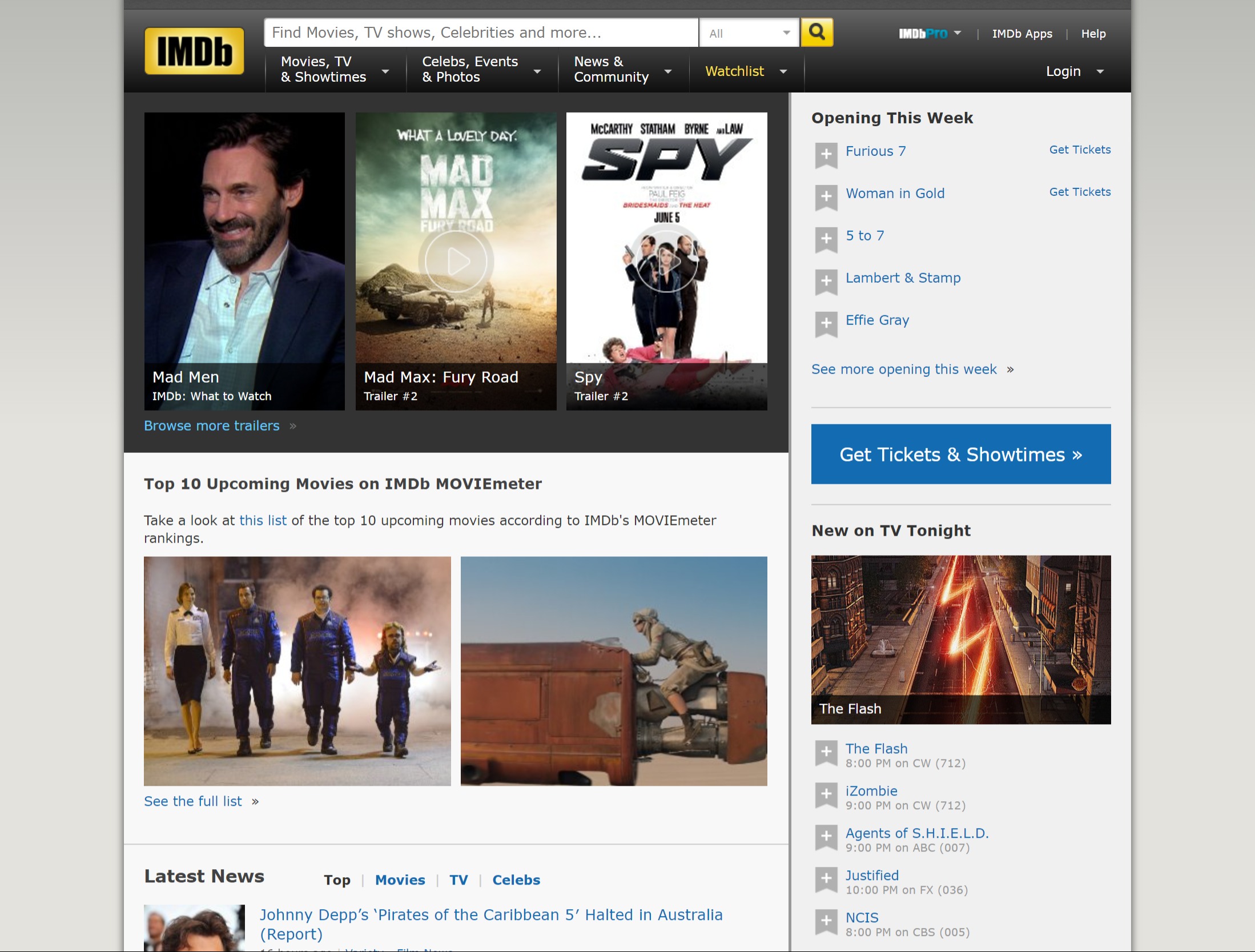
The old IMDb design has been in use since 2013, without much change. The menubar is made up of a gradient, featuring a shiny big logo on the left. The submenus feel cramped and unclear.
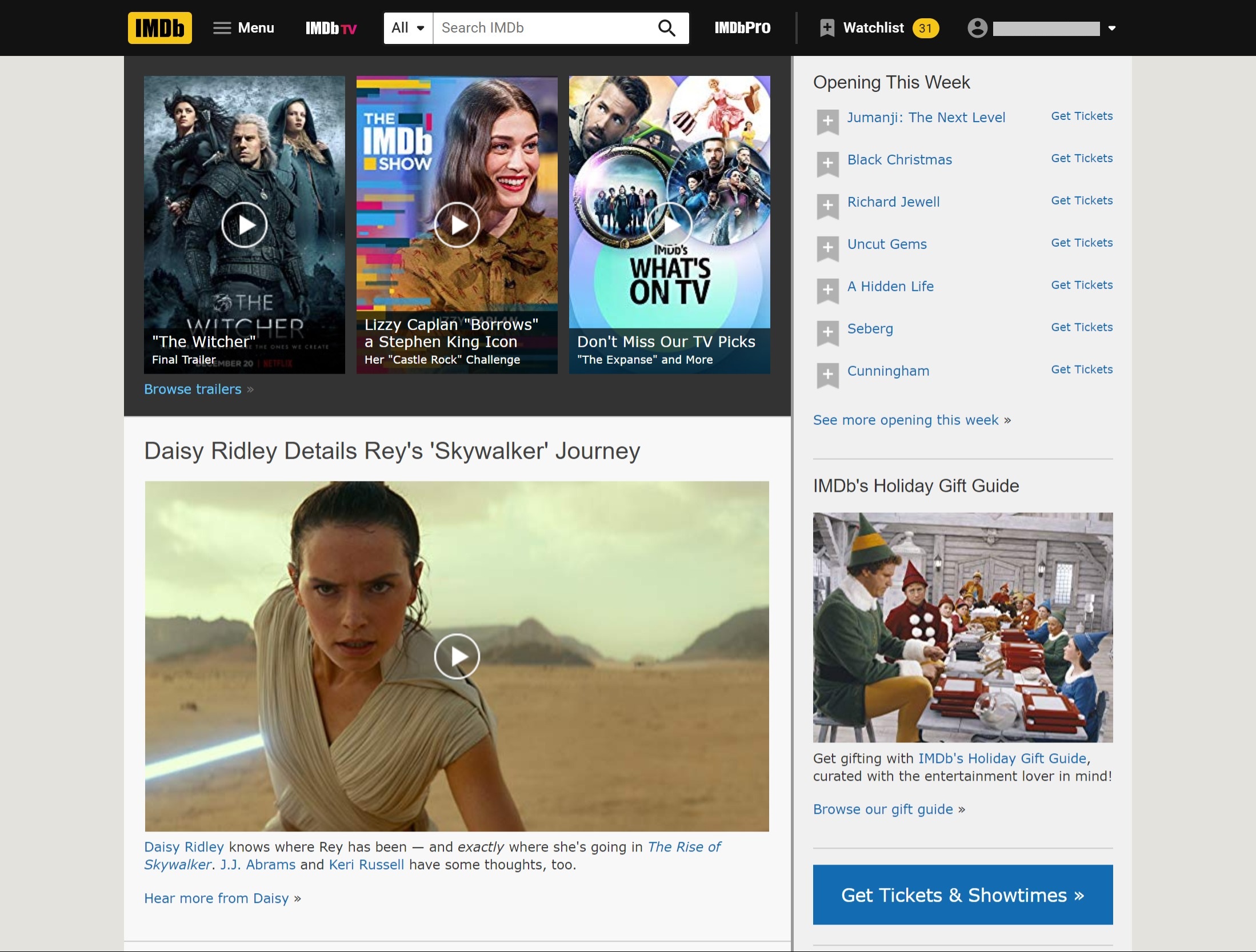
The new design has a more modern-looking menu bar with more room for the content and they have dropped the gradient and changed the logo to be more modern and flat. The design seems to be more adaptive to different screen sizes and the menu and submenus have been hidden into a more organized full-screen menu. The menu doesn’t seem as cramped as before, with the menu links having more space and being organized in more logical categories as before.
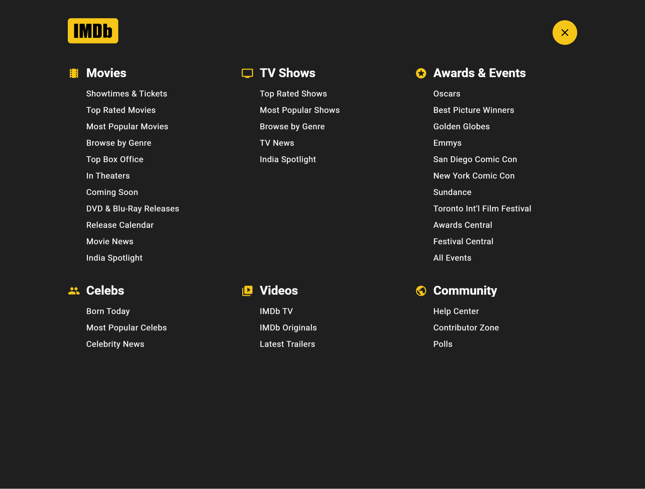
Personally, I believe that a menu that doesn’t take up your entire window would work better though. It doesn’t seem like the menu really needs the space of the entire window and could have just been a larger dropdown menu.