BMW shows off its biggest logo redesign in 100 years
6 March 2020
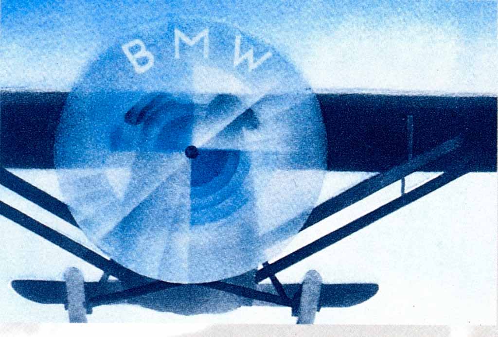
BMW is a car brand that was founded in 1916 whose name stands for Bavarian Motor Works. The company started out as an aircraft engine manufacturer. This was also thought to have been the main inspiration behind their first logo. It is thought that the blue and white circle in the middle of the logo portrays a set of blue aircraft propellers rotating before a blue sky. Others think that the circle is just a cut-out of the Bavarian flag, the German state BMW was founded in. This seems to be the more logical inspiration for the logo while the propeller was only used several years later in an advertisement.
BMW’s logo has remained relatively unchanged in the past 100 years. It started out with golden letters and a golden border which was later changed to the current white letters and border around 1953. A few years later, the slab-serif font was also replaced by the current sans-serif font.
Just like most other car brands, BMW also went through a 3D logo phase in the late ’90s and early 2000s. This trend seems to be slowly going away with more car brands switching to a more modern and flat logo design like Audi, Volkswagen and Toyota.
BMW isn’t just switching to a flat version of their old logo, however. They have changed the black band with the letters on it from black to transparent. They showcased their new logo on the new Concept i4 in Geneva on which they have used a clear material as a replacement of the black band. This big change of their logo seems to have come as part of BMW’s moves to try to create a more luxurious and sustainable image for itself and move away from the aggressive-looking cars the brand is known for.