Brands Are Going Back to Their Vintage Logos
12-8-2019
Lately, some large brands have made some very big rebranding and logo redesigns. Two of these redesigns that are very interesting are those of Volkswagen and Warner Bros. Both of these brands have existed since the early 1900s and have made many major changes in their logo designs. Both of these brands started out with a simplistic, flat logo. This style was also common due to the technical limitation of the time so, over time, their logos became more and more detailed and ‘3D’. When flat and more simplistic logos became more popular in recent years, most brands changed with the trends. However, in some industries like the car industry, 3D logos are still widely used. Mainly because that’s the way they are presented on the cars, making them more recognizable. This is why this is such a big change in terms of logo redesigns.
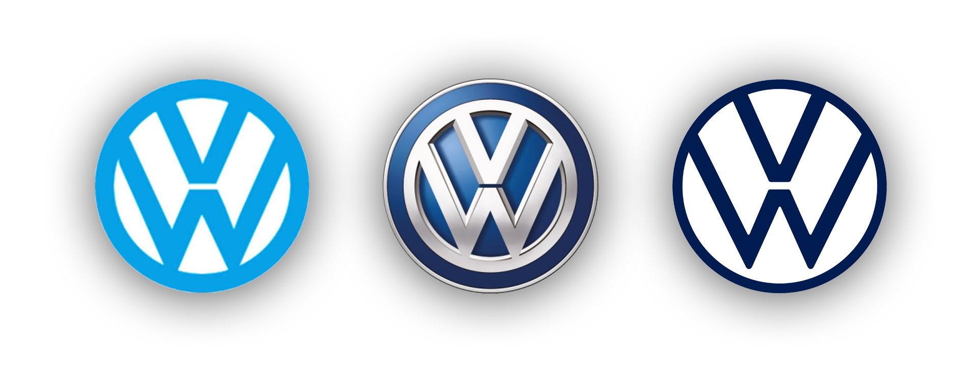
Volkswagen Logo Redesign
Volkswagen was founded in 1937 in Berlin, Germany. Volkswagen’s history, just like many German companies operating at that time, is very dark. The Volkswagen brand was founded by a nazi labor party and their first logo looked just their current logo in combination with spinning wings that are in the shape of a swastika. They used this logo until after the war when they removed the swastika shape. This is roughly when they began using the logo that looks most like the logo that is used today (first logo in the image above). This form of the logo was used for most of the existence of Volkswagen. When car design trends went from boxy and simplistic to more rounded luxurious, they slowly updated their logo to be more 3D and fitting with the rest of the car. During this time, it was common for most brands to use a 3D logo because it became a lot easier to create a logo like that with modern computers.
Besides Volkswagen, we also saw some other car brands dropping their shiny 3D logos for a flatter design. Some examples are Audi (owned by Volkswagen) and Toyota. It certainly seems like it’s becoming more normal to use a flat logo design in the car industry.
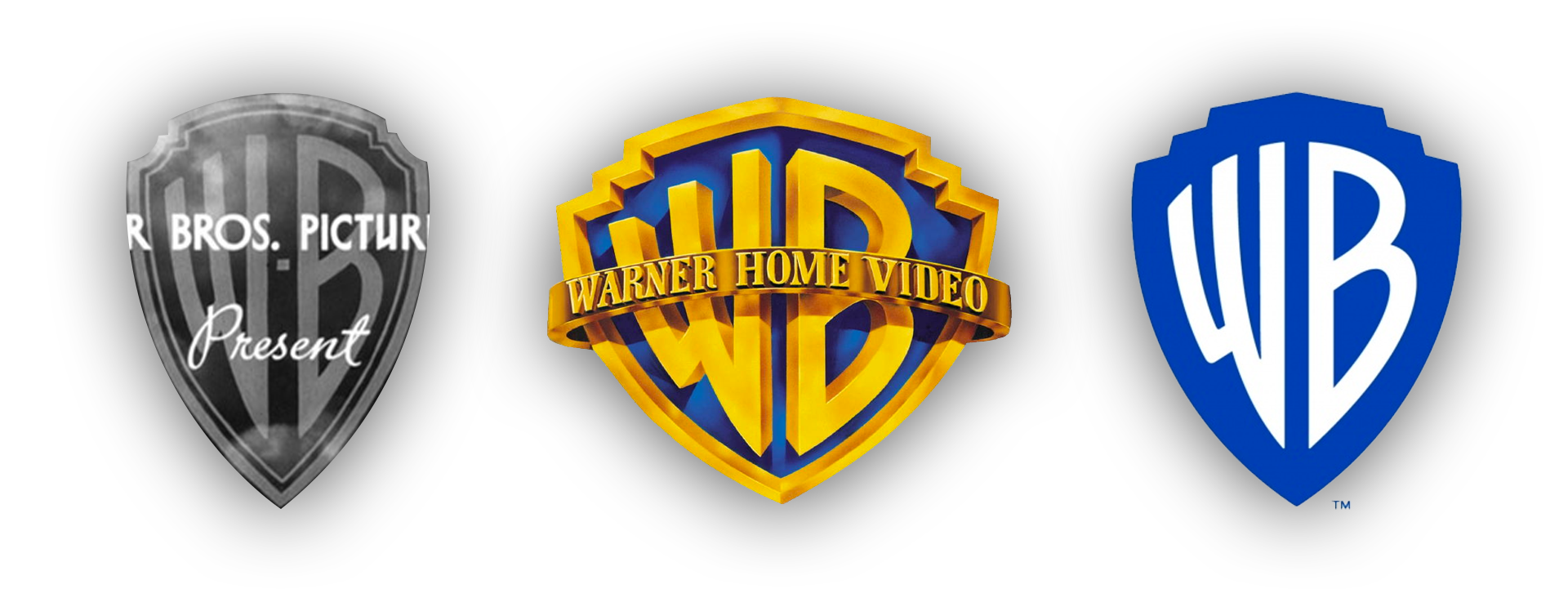
Warner Bros. Logo Redesign
Warner Bros. was founded in 1923 in Burbank, California. Warner Bros. started out as a movie theater business, showing films using a projector. These projectors weren’t as advanced as they are now so their logo was mostly seen in black-and-white, just like the films they showed. When they started producing more films, their logo became more well-known. They didn’t keep their flat, stretched-out logo (first logo in the image above) for very long, only showing it before 4 films before they updated it to look more like the logo that most people know today (second logo in the image above). From 1937 until 2019, their logo didn’t change much. It had some minor tweaks and improvements over the years and they used other logos for some years after the company was sold two times, but they ultimately stuck with the same logo. This changed after Warner Bros. hired famous design firm Pentagram to redesign its logo. This was mostly due to the fact that it was hard to customize or scale the last logo, which was important for Warner Bros’ digital platforms.